
Introduction to soft-proofing in Photoshop
What is soft-proofing?
It’s how we can see what our prints will look like, before we print them, by simulating the print colours in Photoshop. (Not available in Elements, sorry.)
How accurate is it?
If it’s done well, it should be very accurate. There are a few factors which can cause variance (not least of all the ambient lighting in which you work), but as long as you have a little tolerance, it will serve you well.
When should you soft-proof?
I guess strictly speaking you should do it every time you prepare an image for print. But in reality, it’s only important when an image has bright colours that you suspect might be too bright to print ("out of gamut"). After you’ve used your monitor and your lab for a while, you’ll get an instinct for the "endangered" colours.
What do you need in order to perform soft-proofing?
You need an accurate print profile from your lab; and you need a properly calibrated monitor. There’s no point in attempting soft-proofing if you don’t have both of those things.
The experts will tell you you also need a properly-lit viewing booth, but this is a bridge too far for most of us. I think as long as your room is well lit, and the lighting is similar in temperature to daylight (ie not too yellow), then you should be fine.
To begin: Get the profile
Check your lab’s website, or give them a call. Assuming they’re a pro or semi-pro lab, they should be able to provide you with a profile for their printer.
For this exercise, I downloaded the profiles from ProDPI. Their instructions clearly state "Use these profiles for SOFT PROOFING purposes only, please do not convert to printer profiles". That’s good to know – there are some labs who expect you to actually convert your images to their profiles. (This is very poor form, in my opinion – I’d look for another lab.) But most labs, like ProDPI, provide the profile just for viewing, and you submit your images in the standard colour space (sRGB or Adobe RGB).
ProDPI gave me four ICC profiles, for various printers and stocks. If your lab does the same, make sure you use the right one!
Save it
On a PC, you save the profiles into C: > Program Files (x86) > Common Files > Adobe > Color > Profiles. (Or you can simply right-click on the downloaded file and choose "Install Profile".)
On a Mac, you save them into Library > ColorSync > Profiles.
Then start Photoshop.
Do your editing
Ok, so go ahead and edit your images as normal. Some people like to edit with the soft-proof turned on right from the start. I used to do this when I was working in newspapers, but I don’t do it for photographic images. It’s up to you – you’ll soon know what is best practice for your workflow. But to begin with, I would encourage just editing as usual, and worry about soft-proofing if and when you print.
Set up soft-proofing
Ok, here we go …
Choose View > Proof Setup > Custom
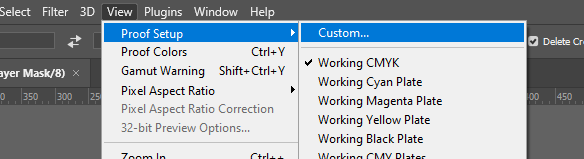
No matter which version of Photoshop you have, this functionality is the same.
The soft-proofing options will come up. Choose the correct profile from the list. Here, I’ve chosen the profile for ProDPI’s small-format printer, on luster.
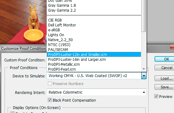
Let’s have a look at what else is in that window:
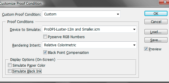
"Preserve RGB Numbers" should stay off. If you find that you need to turn it on to get a print match, something is awry.
"Rendering Intent" and "Black Point Compensation" are a bit too boring and complex to discuss here. Look on your lab’s website for specific instructions. If there aren’t any, then use "Relative Colorimetric", and leave BPC turned on. If you’re not happy with the results, call the lab and ask for their advice.
The "Display Options" make it possible to not only simulate the print colours, but also the white of the paper and black of the ink as well. The only people who need this are people who have their screen calibrated way too bright. Don't be one of those people.
Once you’ve set everything up, you can press "Save" to store the soft-proofing profile for next time. It will then appear at the bottom of the View > Proof Setup menu, for easy access.
What you see
Once you press Ok, the soft-proof is activated, and the name of the soft-proofing profile will be included in the title bar of the image.
The shortcut for soft-proofing is Ctrl/Cmd Y. Toggle it on and off to look for colours which will be changed when printed.
Here’s my example. In this animation, you can see the normal image (which says "RGB/8" in the title bar) compared to the soft-proof (which includes the ProDPI profile name in the title bar).
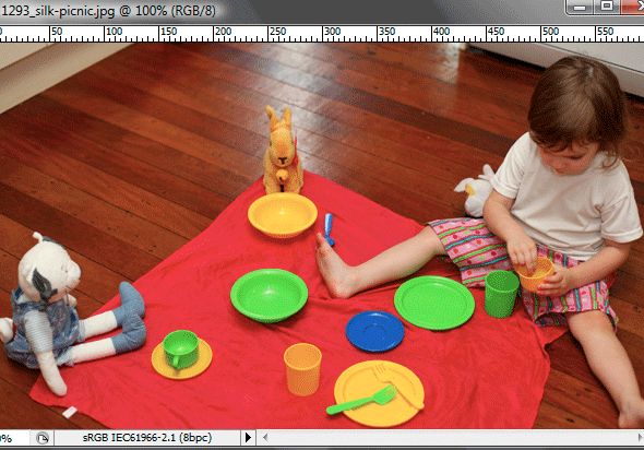
I know this is just a dotty gif file, but you should be able to see the difference. The normal image has plenty of bright detail visible in the red fabric, and the green bowls; whereas the soft-proofed image shows us that those colours are too bright to be printed.
Let’s take a look at the numbers
One of the panels in your Info Palette probably has CMYK numbers on it. You can click on the itty-bitty eyedropper icon beside the numbers to change to "Proof Color". This will then show you the RGB values of the printer.
Here, I’ve sampled a spot on the red fabric:
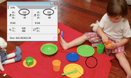
You can see that in normal sRGB colour space, the red channel value of that spot is 219. But that is too bright for the printer, which would clip that channel at 255. And that, ladies and gentlemen, is the essence of soft-proofing. We’re looking for colours that would be clipped if converted – either to 0 or 255, depending on the colour.
Here’s a sample on the green plate:
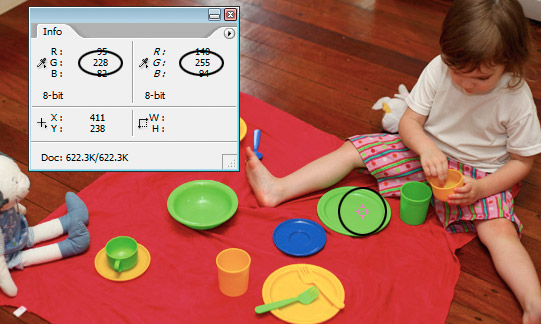
Again, we see that the green was safely sitting at 228 in sRGB, but is blown out to 255 in the print profile.
Here is more proof, if any was needed, that the old maxim "Adobe RGB is the right colour space for printing" is frequently incorrect. ProDPI is a reputable lab, from what I understand, but if you ask them to print an 8×10 on luster, we can see that it won’t encompass all of the sRGB gamut. Adobe RGB? Forget it.
Another way to check
Once you’ve got your soft-proofing set up, there is another method for checking for out-of-gamut colours. Go to the View menu and choose "Gamut warning". Photoshop will then highlight the o-o-g areas with grey, like this:
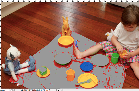
Frankly, I never use this method. It’s really brutal, and it makes you want to cry. It makes the problem seem much worse than it really is. Plus, I’ve read plenty of experts who say that it’s not particularly accurate anyway. Forget about it.
Ok, what now?
Let’s say you’ve toggled your soft-proof on and off, and seen some colours which ain’t gonna make it. You have two options – ignore it, or do something about it.
Option 1 – ignore it
If the colour shift is only minor, and you’re in a hurry, and heck, nobody will notice anyway, then forget about it. Life’s too short, right?
Option 2 – do something about it
Let’s take a look at that animation again:
As you can see, out-of-gamut colours cause loss of visible detail. The subtle shape of the wrinkly fabric becomes a smooth, featureless (and in this case darker) mass.
There’s only one way to preserve that detail, and you probably won’t like it. You need to partially desaturate the bright colours to bring them into the print gamut.
If you’ve already flattened your layers, then you’ll need to make a new Hue/Saturation layer, and gently desaturate the relevant colours as necessary.
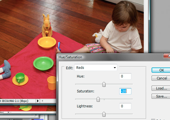
Here, I’ve dropped the reds by 20%. You can also jiggle the lightness, and sometimes even the Hue, to get the best possible result.
The great thing is, you can continue to toggle Ctrl Y while the Hue/Sat dialog is open, so you can check your progress. And you can also watch the Proof numbers in the Info Panel as well. So there’s no need for guesswork.
By dropping the saturation by 20%, I’ve recovered all the wrinkle detail in the fabric. It’s duller, but it’s there. And that’s the perpetual trade-off when dealing with out-of-gamut areas … you can have the brightest possible colour, with no detail, or duller colour, with correct detail. Your choice!
The better way
If you’ve been good, and done all your editing using adjustment layers, then it’s often better to re-visit the layer that caused the too-bright colours in the first place. If you ran a "colour pop" action that boosted the colours, then that’s probably the culprit. Go back to that layer, and reduce the strength, or the opacity, to bring the colours into range.
Don’t go nuts
Sometimes it’s damn near impossible to rescue every little pixel of out-of-gamut colour. Don’t sweat it. As long as you can toggle Ctrl Y and be satisfied that you’re not losing any major details, then that’s fine. Little patches in the shadows, or whatever, are no big deal.
Go!
Once you’ve soft-proofed, and made the necessary adjustments, then flatten, save, and send to the lab. All things being equal, your prints will come back as you expect.
A couple more things
If you toggle Ctrl Y without first setting up the proper soft-proof profile, then Photoshop will show you a CMYK soft-proof by default. This may look awful! CMYK isn’t particularly kind to bright colours, or to dark ones for that matter. I’ve known people to panic because they thought their beautiful image was going to be ruined. If the title bar says "RGB/8/CMYK" then you’ve done it wrong. Make sure you use the correct profile.
I’ve just talked about colours that are too bright to print, because this is where most problems will arise. Sometimes a soft-proof will show colours shifting a little as well – blues which turn purple are a common one. If it’s a problem, do whatever you need to do to fix it … Hue/Saturation, Curves, whatever.
Soft-proofing is most commonly required for press printing. This is because CMYK colours can be so different from the original RGB colours. If you work with CMYK colours a lot, my Prepress Class will change your life, I promise.