
Powerful Gradient Map techniques
The most common use of Gradient Map adjustment layers is for black-and-white conversion, but they are capable of all sorts of cool stuff. Let me show you how to add colour and tone effects to your photos using Gradient Maps set to "Soft Light" mode.
I’ve used Photoshop Elements 9 for all the screenshots in this tutorial, because I never want to miss an opportunity to show Elements users how powerful their software really is. Needless to say, these methods also work in Photoshop, as well as all older and newer versions of Elements.
As the subject of this demonstration, I’m going to begin by applying that purply-orangey look with which the industry was saturated for a while.
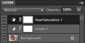
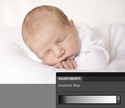
Here’s a photo of my son, to which I’ve done a bit of basic clean processing, using a Levels layer and a Hue/Saturation layer:
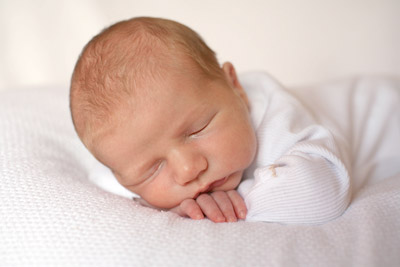
For best results, ALWAYS do your clean processing first. If you don’t, you’ll never get consistent results from your artistic processing, and it will drive you crazy.
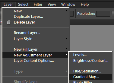
To begin, add a Gradient Map adjustment layer. Layer > New Adjustment Layer > Gradient Map
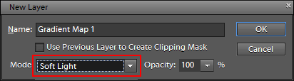
Change the blend mode to "Soft Light" – this is the key to the whole thing:
Now you have a Gradient Map adjustment layer. Usually it will be black-to-white by default (though not always). To edit the gradient, click on it …
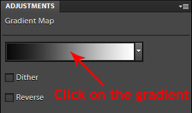
… and you’ll get a screen that looks like this:
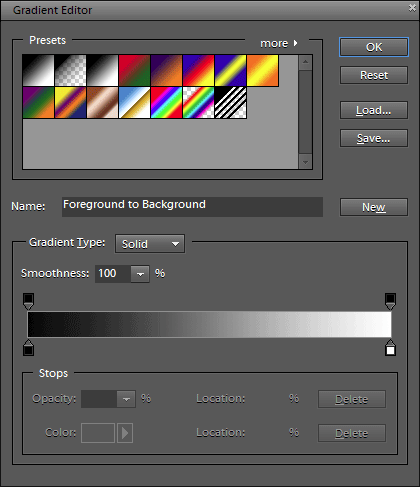
The parts that interest us are the two sliders below the gradient. First, click on the left one – this is the one that controls the dark tones of your image:
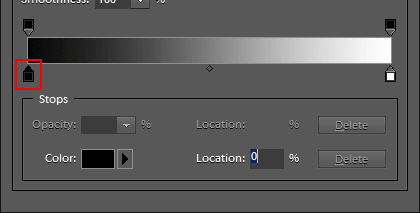
Then click on the Color box …
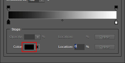
… and you’ll get yet another window:
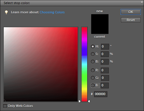
I’ve chosen a rich purple colour for the shadow tones in this image:
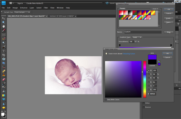
I press Ok to confirm my purple selection, which brings me back to the first window, where I can click on the highlight slider, then on the Color box again:
I choose a pale yellowy/orange, and press Ok:
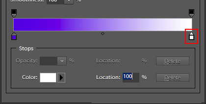
One more thing. When you’ve got either of the sliders selected, you’ll see the little slider which designates the midtone point. Moving this left or right allows you to control which colour dominates the effect:
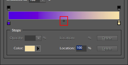
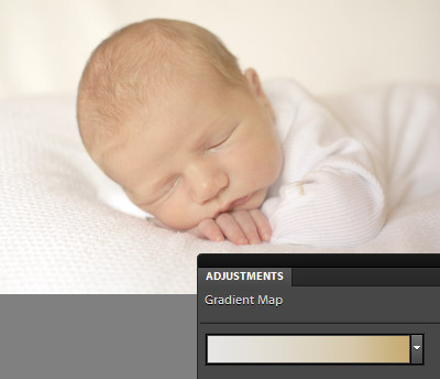
I moved my middle slider a bit to the left, so that the warm highlight tone was a bit more prominent. This was the resultant gradient:
And this was the resultant image. You can see the purplish tones in the shadows, and the yellowish tones in the highlights:
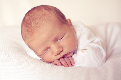
This was how it looked before:
Now, here’s the important bit. Once you create a gradient map that you really love, you can save it to use again and again. In the Gradient Editor, highlight the "Custom" name:
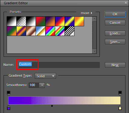
Then give it a meaningful name, and press the "New" button:

It will then appear among the Presets:
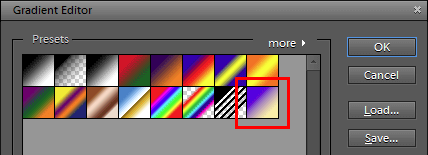
(Note: To back up your presets, hit the "Save" button on the right-hand side to save them to your hard drive.)
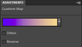
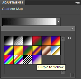
Now, when you add a Gradient Map adjustment layer, your colour tone will be available to select from the pull-down menu. Easy!
Here are a few more examples …
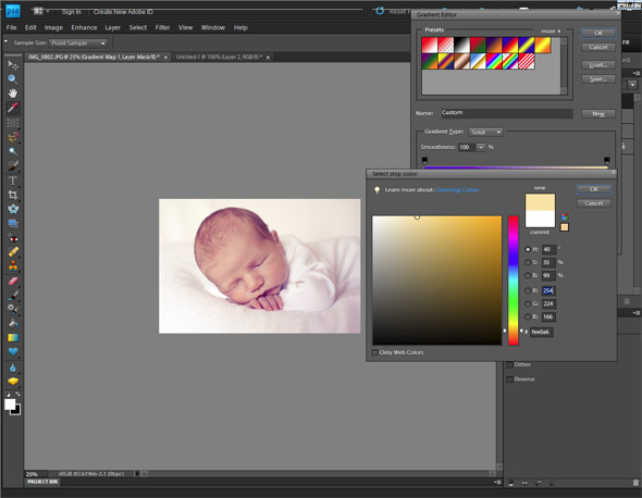
If you want that really pale creamy look, set the shadow (left) end of the gradient to a very light colour:
If you want the pale look without any additional colouring at all, just use a black-to-white gradient, but move the middle point a long way to the left:
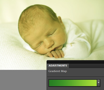
Go crazy! A green-to-yellow gradient gives a sort of cross-processed look:
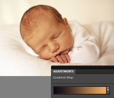
And a black-to-rich-orange gradient gives a strong warm tone:
The possibilities are endless!
A couple of things to mention …
- Play with other blend modes for even more effects. Soft Light is the best one, but Screen and Multiply can be fun too.
- If you want one end of your gradient map to be completely benign (ie not have any effect at all) set it to middle gray – R/G/B=128/128/128
- Of course, you can adjust the opacity of the Gradient Map layer, and mask it if necessary.
Have fun!