The wide gamut myth
Or: Why you must work in sRGB
Possibly the greatest curse of the photography industry is the persistent myth that editing must be done in a large colour space. I despair when I think of the thousands of workflows that are complicated, and the countless images ruined, by this terrible advice. If it were possible to tally the monetary cost of wasted work hours, and photo reprints, all over the world every year because of this misinformation, it would be an eye-watering sum.
Adobe themselves are largely to blame. I love Adobe and their amazing software, but their large-gamut default colour settings in their programs is a dreadful mistake.
There exists an unshakeable fallacy that editing in large colour spaces is "what professionals do". Too many people will confidently tell you that working with Adobe RGB or ProPhoto RGB is what you must do if you, too, want to be a professional photographer. They'll tell you that you mustn't work in sRGB because it's the colour space for consumers - people taking photos with their phones. They'll try to make you believe that sRGB has a tiny gamut with very few colours in it. They'll tell you it's only for web, whereas Adobe RGB is for printing.
These things are not true. sRGB is for almost everyone. sRGB is a lot bigger than you think, and it easily contains most of the colours that you need in your images. And anyway, even as I write this, there is still only a small percentage of screens in the world that can show a greater range of colour than sRGB. So there aren’t many people in the world whose screens can show them the colours of Adobe RGB, and none at all which can show ProPhoto RGB.
And even if your screen can show the greater range of colours, you have to be one of the lucky few who prints on an expensive high-end wide-gamut printer. Such printers exist, of course, but not many of us use them. (More info).
See where I’m going with this? It’s true that a tiny number of people in the world, with the right screen and the right printer, really can use Adobe RGB. But I’m not in that number, and chances are you’re not either. We work on screens that can show us no more colours than sRGB, and we print at labs who can’t print any more colours than sRGB. In some areas of the spectrum, quite a deal less, in fact.
Analogy:
If you have room for four passengers in your car, and have four spare tickets to a football game, is there any sense in inviting five of your neighbours to come with you?
Of course not.
Even if you could hide the fifth guy in the boot ("trunk" for my foreign friends) where he couldn’t be seen, he wouldn’t be able to get in to the game without a ticket anyway.
Now, consider this …
If your computer screen can display colours no brighter than the sRGB gamut, and your lab can’t print colours brighter than the sRGB gamut, is there any sense in processing your images in the Adobe RGB or ProPhoto RGB space?
Of course not.
If you can’t see those extra colours, or reproduce them, there’s no sense in "inviting them along" in the first place.
So it makes no sense to work in anything other than sRGB.
If this is all new information to you, you might be rushing to your camera to make sure it's set to sRGB. Don't bother! The in-camera colour space only applies when shooting jpegs. Jpeg mode really is for consumers. Anyone who takes their photography seriously shoots in raw mode, and I trust you are one of those people. Raw files contain the huge amount of colour that your camera saw; much more colour than can be stored in a jpeg file.
So we begin each photo's journey with a raw file containing huge amounts of colour, and we must end with a final file that contains only the colours we can use. And this is the source of the worldwide confusion - at what point in the workflow should that transition take place?
The answer is: During raw processing. Raw processing is the only time in the workflow when you can safely manipulate the colours that you can't see. What? How? With the help of the histogram. The histogram in your raw program accurately represents all of the colours in your file, both the colours your screen can show you, and the colours it can't. This is so important. No such histogram exists in Photoshop. If you take your image to Photoshop while it still contains colours that you can't see, you're flying blind.
This, my friends, is the simple truth that nobody ever tells you – the core purpose of raw processing is to convert from "Huge colour range" to "Usable colour range". Never mind what amazing creative functions your raw software has. When you boil it down, this one role is at the heart of it all. Manipulating the camera’s enormous data into a form you can use.
(Astonishingly, Adobe lost sight of this truth when they designed Lightroom. By not providing the user with an sRGB histogram, they created a program which did everything except the one thing it needed to do. By Lightroom 4, thank goodness, they realised their error and partially corrected it with the introduction of soft-proofing, but it’s a clumsy workaround, AND their clipping warnings still don't work. I yearn for Adobe to rebuild Lightroom from the ground up to fix this problem, but that seems very unlikely.)
Once you’ve processed your raw file into sRGB, the rest is plain sailing, you see? You can confidently work on your photo in the knowledge that you can both see and reproduce all the colours you’re editing. That is so important. The "s" in sRGB stands for "standard", but it could equally stand for "safe" and "sensible".
Despite all this, there are still lots of people telling you to process your raw files in a large colour space (Adobe RGB or ProPhoto RGB), then continue to edit your photos in that space, even in Photoshop. "Work with all the colours" they’ll say. Of course, we know this is nonsense, because you can’t see all those colours on your screen. Only the sRGB-ish portion of them.
Then they’ll tell you to convert to sRGB when you’re ready to save for web, or print. They might even point out the handy "Convert to sRGB" checkbox in the Save For Web dialog. Or the handy sRGB selector when exporting from Lightroom. What they won’t tell you is the clipping this will cause. Colours you thought were safe, suddenly get clipped (blown out) and lose detail. A very nasty surprise. Who likes nasty surprises?
Or even worse, they’ll neglect to tell you to convert at all. They’ll leave you to wonder why your web images look dull and lifeless, and why your prints have lost detail. If you’re lucky, you’ll quickly find your way to a forum of good folk who will explain the problem and show you how to fix it. But not everyone is so lucky – I’ve known some people to buy new equipment and go to considerable expense of repeated printing, trying to figure out the problem on their own.
So please ignore those large-colour-space people. At best, they're well-meaning but mistaken. At worst, they're inflating their own egos while sabotaging your work. Either way, they're definitely not helping you.
Footnotes:
- You might have heard that sRGB images can't be very colourful. This, I assure you, is completely wrong. If you want to push your photos to the colour limits of sRGB, they can be very colourful indeed. But pushing to those limits, without going beyond them, takes skill. This is the great irony of the whole myth - editing in sRGB is difficult. Any beginner can open an Adobe RGB or ProPhoto RGB photo and recklessly increase its saturation, or apply a colourful preset, being blissfully unaware that they can't see the colours they're creating, nor print them. It actually takes some professional skill to create vibrant yet useable colour. But the people who don't know how to do this are the ones bleating "sRGB is unprofessional". Bizarre.
- Needless to say, sometimes you’ll encounter vivid colours in your photos (such as clothing or flowers) that naturally exceed the sRGB or printable gamut. As much as we’d love to be able to wave a wand and magically use those colours, we can’t. So we have to manage them within our limitations. I’ve written about these issues here and here.
- Even when colours are safely within sRGB, some of them still might not be printable. If you have Photoshop (not Elements, sorry) you can check them before printing.
- Remember that sRGB is vital if you’re selling digital files to clients. Please read this if you haven’t already: Selling Digital Images
- Likewise, sRGB is the only colour space for web photos. Info
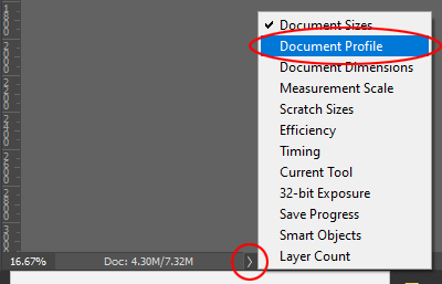
- Even if you think you're working in sRGB, the setting can sometimes change without your knowledge (usually when Adobe rolls out a software update). So always keep "Document Profile" switched on in Photoshop and Elements at all times, and remember to glance down there every time you open a photo.