
That rich look
A while ago I was asked how to achieve "that rich dark look". I’d already mentioned it, in a roundabout way, in this post, but I think it’s worth elaborating.
Obviously there are numerous ways to achieve any effect, and this is only one. I’ve taken all the following screenshots in Photoshop Elements 9, but the method is identical for all versions of Photoshop and Photoshop Elements.
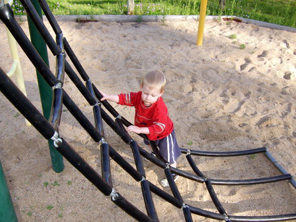
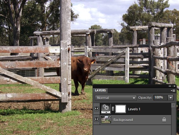
I’ll start with a standard clean photo, to which I’ve done a basic enhancement using a couple of Levels layers:
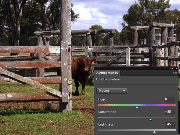
To commence the fun, I add a Hue/Saturation adjustment layer:
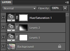
And change its blend mode from "Normal" to "Multiply". This is the crux of the method.

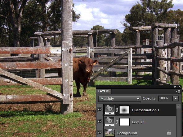
This makes the photo darker and richer:
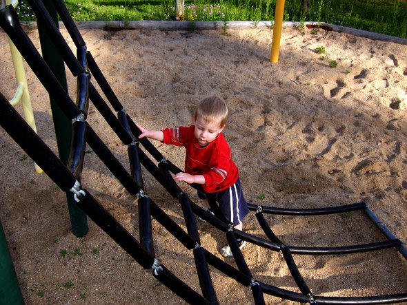
Maybe too dark, maybe too rich. Maybe not rich enough? Whatever. I’ve laid the foundation.
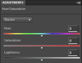
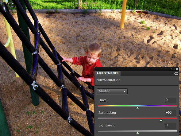
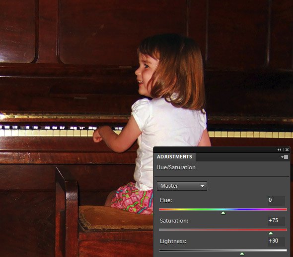
In the Hue/Saturation dialog, the Hue slider isn’t important for this method. I want to concentrate on the Saturation and Lightness sliders. Essentially, the Saturation slider controls the richness, and the Lightness slider controls the darkness.
First, I increase the Saturation slider to give it some real intensity of colour:
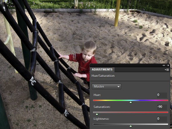
In most cases, you’d increase the saturation for this method. But keep in mind that desaturation can also give you some interesting results:
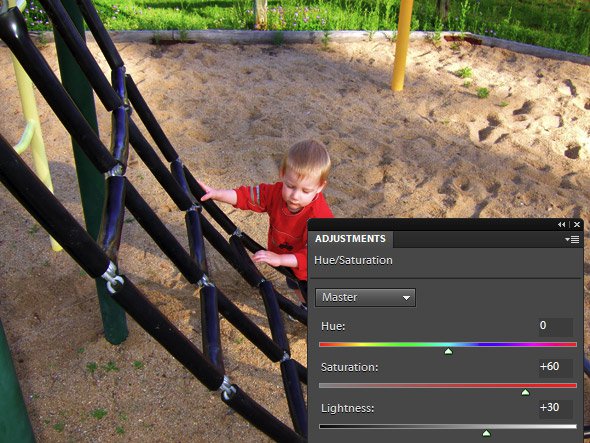
Anyway, I’m sticking with increased saturation for this photo. Then I adjust the Lightness slider, because frankly, it was a bit too dark for my taste. Ah, that’s better:
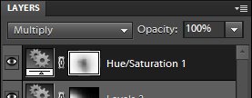
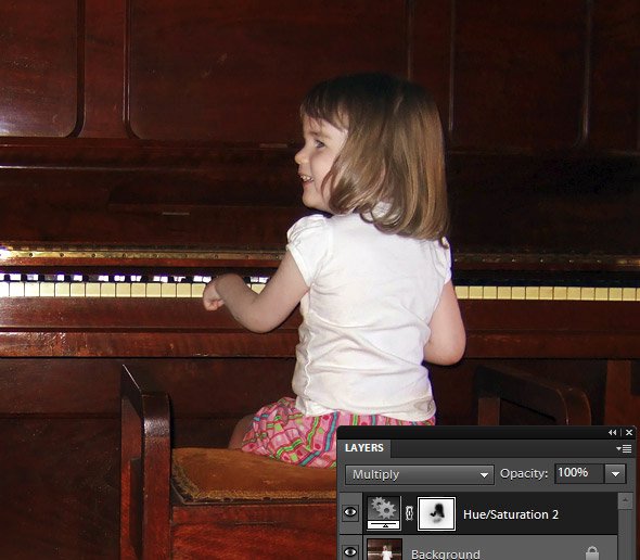
It’s a bit too much on Rowan himself, so I take a soft, low-opacity black brush and paint on the mask to partially reduce the effect:
The result is a lovely rich background, but not too overpowering on the subject. (I forgot to take a screenshot of the final result – d’oh!! Sorry.)
Let’s take a look at another one.
First, with a bit of clean processing; then with the effect applied; then masked back a bit:
And another one:
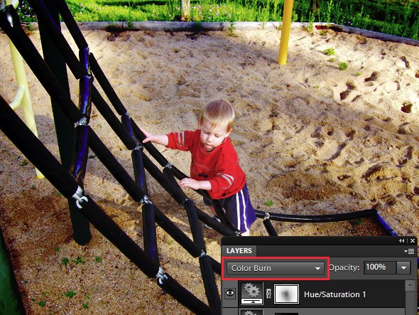
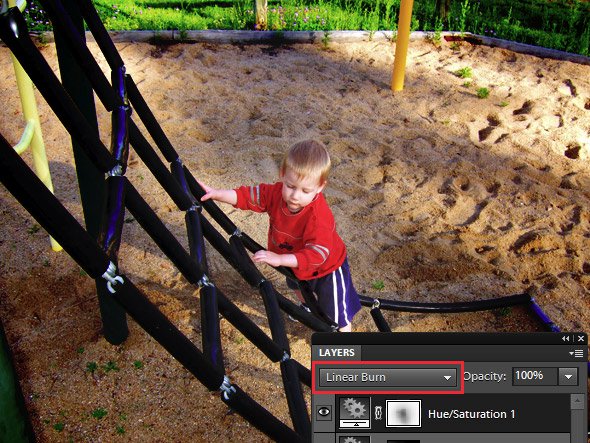
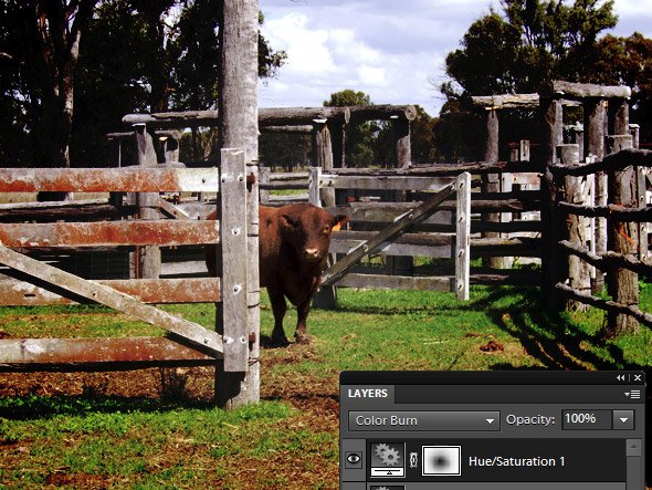
One more thing to mention. If you think the Multiply mode is fun, you should also try the next two – "Color Burn" and "Linear Burn". They give even stronger results. A bit too strong for my taste, actually, but you might love them!
Here’s Rowan with the Hue/Sat layer on "Color Burn" mode:
And on "Linear Burn" mode:
And check out the cow on "Color Burn" mode!
I hope you have fun playing with this!