
What nobody tells you about Curves
Curves are a very powerful tool. But there’s something important that rarely gets mentioned.
The importance of Curves and Levels
Curves and Levels are the fundamental Photoshop skills, in my opinion.
To use Curves and Levels is to manipulate the colours exactly how you want to. No tricks, no guesswork. Users of Curves and Levels have a genuine understanding of the pixels they’re editing; the same can’t be said for users of actions, presets, etc.
The importance of Curves and Levels can’t be understated. I encourage everyone to learn one or both.
The web is full of excellent tutorials about Curves and Levels, so you needn’t fiddle blindly. Find some good resources, and begin improving your skills immediately.
However, there’s an aspect to Curves adjustment (and to a lesser extent Levels) that is often neglected in tutorials.
Give and take
The big thing that people need to understand with Curves, is that for every action there is an equal and opposite reaction, so to speak.
Articles speak airily of "adding control points to add contrast", but they never explain that if you add contrast to one part of the tonal range, another (equal) part of the tonal range loses contrast.
Put simply, any part of the curve that is steeper than its original 45 degrees has improved contrast, but any part that is flatter than 45 degrees is now flatter in detail.
Here is a simple "midtone bump":
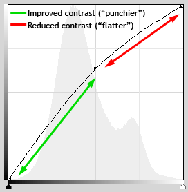
If you make a single point in the middle of the curve and move it up, the visible effect is to lighten the image. In doing so, you’ve created contrast in the darker half of the tonal range, but reduced contrast in the lighter half.
(Note that this is not unique to Curves – a midtone Levels adjustment has the same effect)
Likewise, if you make two points, and create an S-curve …
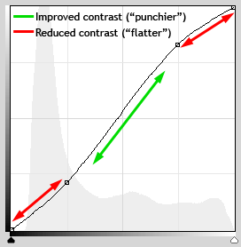
… you’ve made your midtones more contrasty, but flattened the shadows and highlights.
Is this a bad thing?
Not necessarily. In some cases it’s unavoidable, acceptable and even desirable.
I am not writing this to scare you away from Curves adjustments – far from it. I’ve already stated my fondness for Curves and Levels adjustments.
All I want to do is make you watch closely, and think carefully about, the effect of your adjustments, to learn from them.
The best option
Wherever possible, you should strive for straight line contrast in your images. That is, move the end points of the Curve in at one or both ends (as the histogram allows). This means you get nothing but contrast!
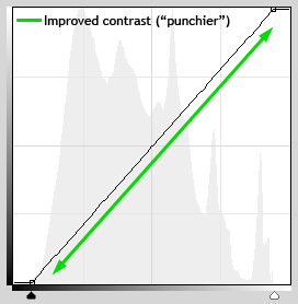
Then, after the straight-line adjustment, you can make mild midtone adjustments for perfect results.