
Spyder5Elite calibration tutorial for desktop screens – Brightness & colour not right
Consider your light
I know I’ve said this before, but I have to hammer it home again. NEVER underestimate the effect your surrounding light has on the way your photos appear. You’re on this page because your screen and prints differ in colour. Before proceeding, I need you to make a frank appraisal of the light in your room. If it’s too yellow (which is the most common problem) it will make your prints appear yellow, and therefore cause you to conclude that your screen’s calibration is too cold.
If you think, or even suspect, that your light is the culprit, take steps to rectify it. Get whiter bulbs if you can, or at least try assessing your prints in daylight. I would hate to be wasting your time with all of these calibration adjustments if the calibration wasn’t actually the problem.
If you’re sure the light is ok, read on …
Let’s try again
Press "Next" …
… and you’ll come to this screen:
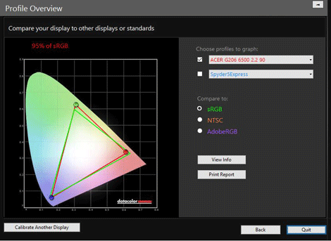
Ignore the graph and everything, it’s meaningless for now. Go straight down to the bottom left corner and click "Calibrate Another Display":
Of course we’re not intending to calibrate another display – we’re going to aim for a better calibration of the same one.
That button brings you back to this screen:
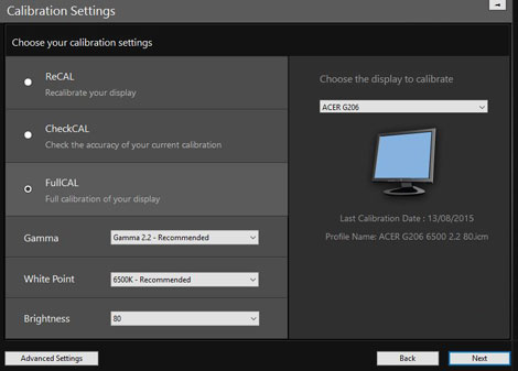
If it happens to take you to the "Advanced Calibration Settings" page, just hit the "Basic Settings" button at the bottom.
Make sure it’s set to "FullCAL", then turn your attention to the settings.
First, brightness
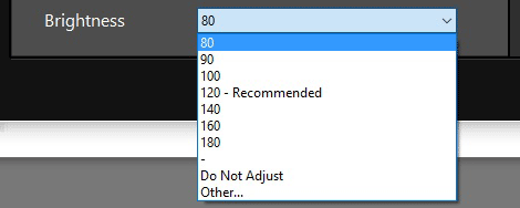
What setting to choose
- If your screen is presently darker than your prints, you need to choose a higher number than before.
- If your screen is brighter than your prints, please, I beg you, consider the light that you’re in. 80 should be as low as you need to go if your light is good. However, if you’re sure your light is good, or you simply can’t make it any brighter, choose "Other" and try 70.
Then, colour
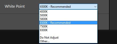
What setting to choose
- If your screen is presently warmer than your prints, you need to choose a higher number than before.
- If your screen is colder than your prints, you need to choose lower number.
For example, if I’d calibrated to 6500K the first time, and found that my screen was a bit too blue compared to the prints, I’d choose 5800K this time. If I had come around to this screen a second time, because the screen was still too cool, I’d go to 5000K.
Once you’ve chosen your new target, press "Next". That will bring you again to this screen:
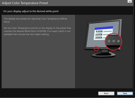
At this point, I find it difficult to advise you. Your decision here will depend on your monitor, I think. If you’ve chosen a slightly warmer white temperature target, and your monitor has a slightly warmer colour preset, it might be a good idea to make that change. (Or to a cooler preset if you’ve chosen a cooler temperature target, of course).
But not all monitors have a very good range of presets to choose from. Some don’t have many presets at all; others have presets that are wildly different from each other – WAY more difference than you need. And others have lots of presets, but they’re called ambiguous nonsense like "Game" and "Movie" and stuff, instead of numeric temperature values.
And let’s face it, you already chose the best preset right at the beginning. So if you don’t think any other presets will be any good, don’t be afraid to leave your monitor on its current setting.
Press "Next".