
The "Blend If" sliders in Photoshop
It’s taken me a long time to write this article, because relevant examples are hard to come by. The "Blend If" function is an obscure but occasionally very useful part of Photoshop (not Elements, sorry). I hope you’ll find this article interesting, and I hope you’ll have fun playing with layer blending, but the truth is there’s not much practical day-to-day use for these sliders. In fact, you might only need them once or twice a year.
I’ll be blunt: After you’ve read this article, you won’t fully understand the "Blend If" feature. It’s too darn confusing to learn just by reading about it. I’m writing this article to encourage you to play around with the sliders and learn by doing and seeing. It’s good fun!
Let’s start with the confusing wording. I understand why they’ve named it the "Blend If" function, but it’s easier to think of it as the "Make see-through if" function. That’s what it’s all about, you see. It gives us some control over which parts of the layer are transparent, based on their lightness or darkness.
So to experiment with the sliders, first you need a file with at least two layers. For this example I’ve opened a flower photo …
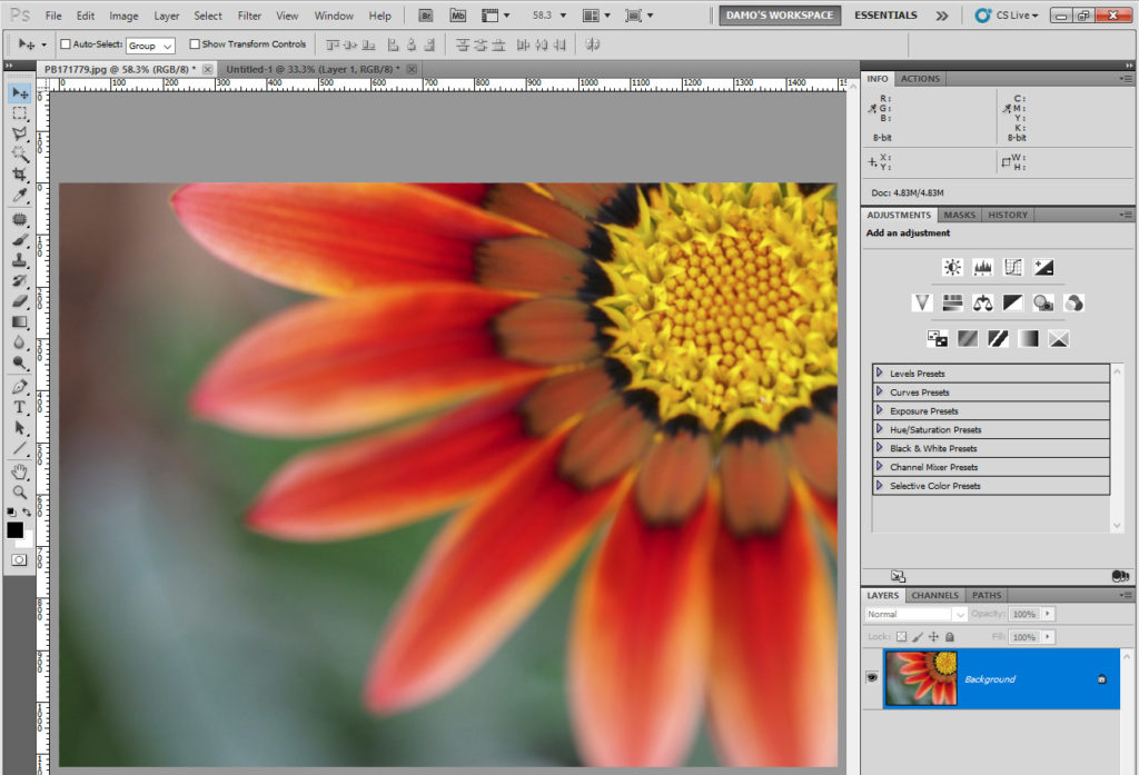
… then added a new layer and filled it with clouds (Filter>Render>Clouds):
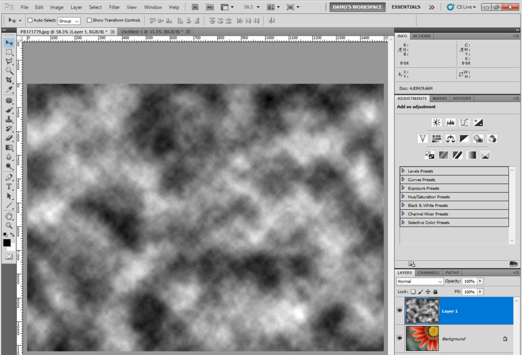
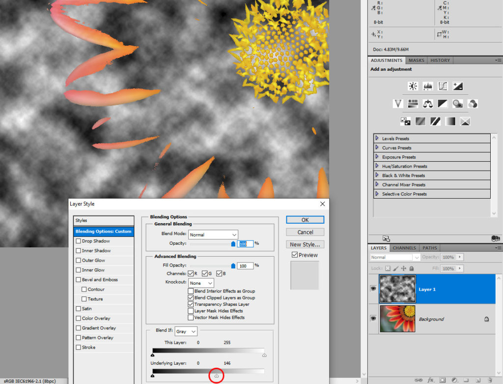
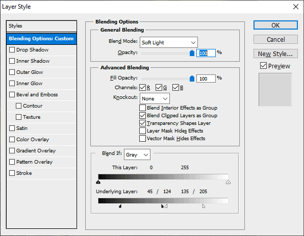
To access the Blend If sliders you either go to Layer>Layer Style>Blending Options, or simply double-click on the layer (but NOT on the name of the layer):
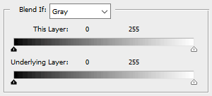
That brings up this window:
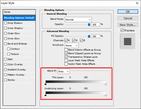
There is a whole world of fun to explore in this window. You’ll enjoy all of it. But for now, let’s just concentrate on the Blend If section.
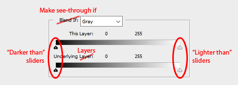
As I said earlier, it makes more sense if we call them the "Make see-through if" sliders. It gives you two sets of sliders – one for "This layer", and one for "Underlying layer". The latter is also misleading. The second set of sliders isn’t just for the layer underneath the one you have selected, it refers to ALL the layers underneath it, no matter whether that’s one or one hundred.
The sliders themselves are the crux of it, of course. They are the "Darker than" and "Lighter than" sliders. The black ones say "I’ll make your layer see-through in areas where its colour is darker than this". And the white ones say "If your layer’s colour is lighter than this, I’ll make it see-through in those areas".
By default, the black sliders are at the blackest end of the range, and the white sliders are at the whitest end of the range. And as there’s nothing darker than black, or lighter than white, of course no parts of your layer are see-through when you first open this window.
I’ve attempted to create some animations to show you how it works:
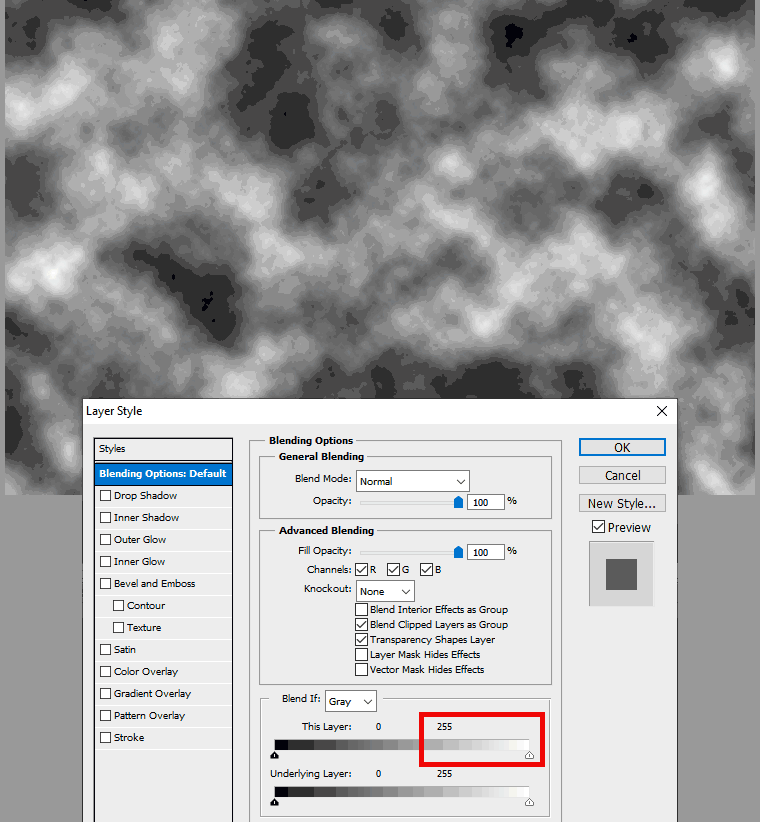
In this example I’m slowly moving the white slider on the "This layer" grey bar in and out. As I move it in, the brightest parts of the layer become see-through, and the flower becomes visible from underneath.
Now let’s look at the black slider:
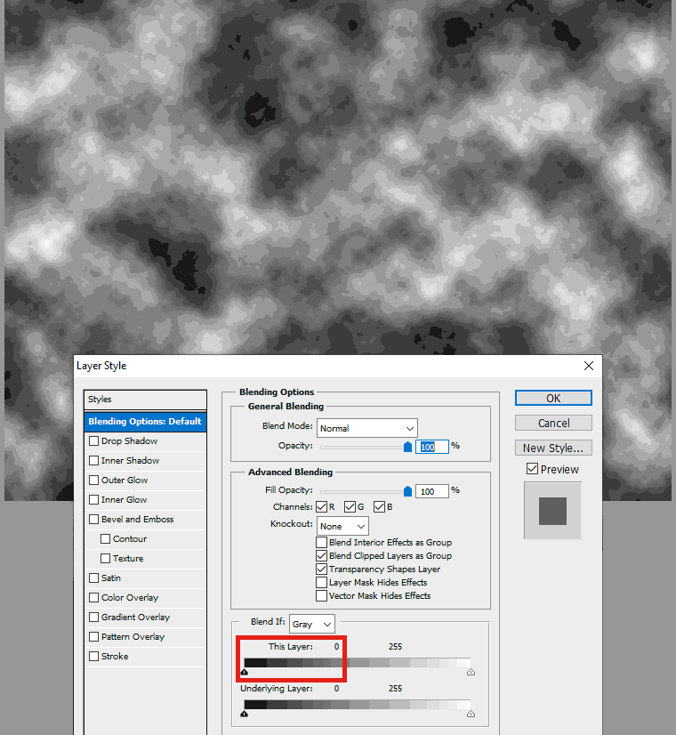
I’m moving the slider a bit faster this time, and as I go, the darkest parts of the photo become see-through, revealing the flower in those areas.
Have you got a file of your own open? I encourage you to play along and watch it for yourself.
What about if you use the "Underlying layer" sliders? Remember (this is a bit confusing) that they still control the transparency of the layer you have selected (the clouds layer in my case) but its transparency is dictated by the light or dark areas of the underlying layer/s.
In the above screenshot I’ve moved the white slider that reads the brightness of the underlying (flower) layer. Where the flower is brightest, the clouds layer becomes see-through.
Confusing? You betcha. As I said, it’s vitally important that you play around a lot. Understanding comes with time and practice.
So that’s the basics of it. Slide the sliders to control which dark and/or light areas become see-through. But it’s not very useful, is it? Because the edges are so hard and jagged. Not very pretty. That’s where the Alt key comes in.
If you hold down the Alt key (Option for Mac) you can split the slider in half. That makes the transition from solid to see-though more smooth:
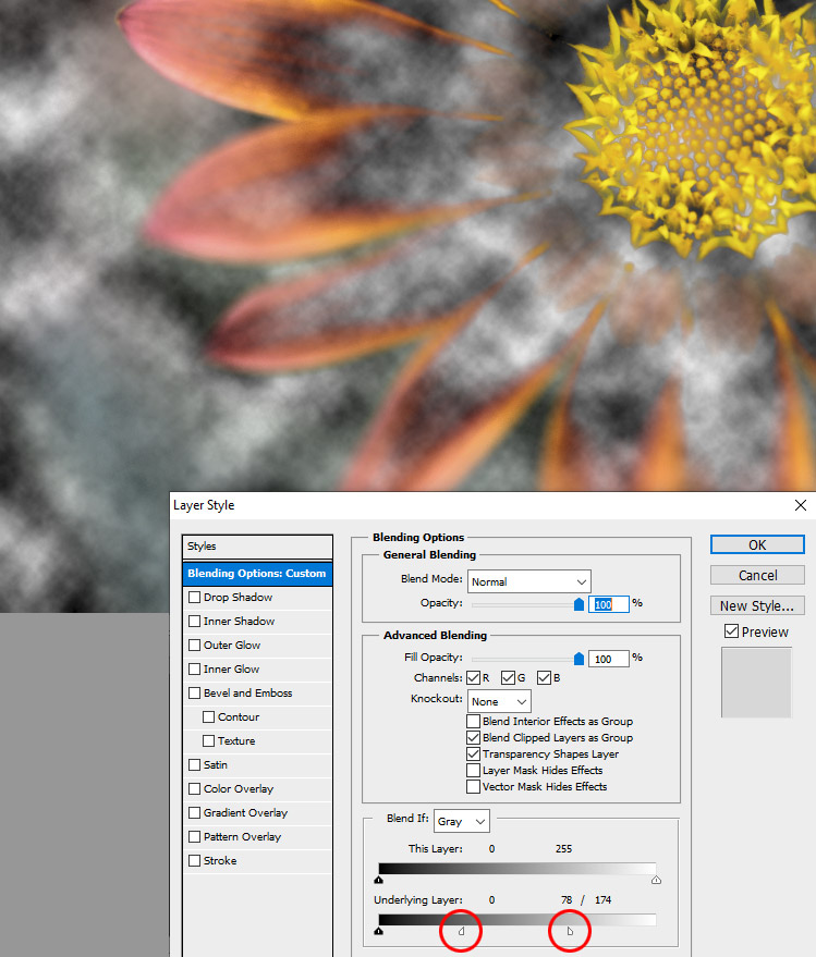
See how those edges blend now? The further apart the slider segments are, the smoother the blend will be. But if you take them too far apart you might start to include or remove detail that you didn’t want to. So you need to choose your slider positions carefully.
Here’s another example:
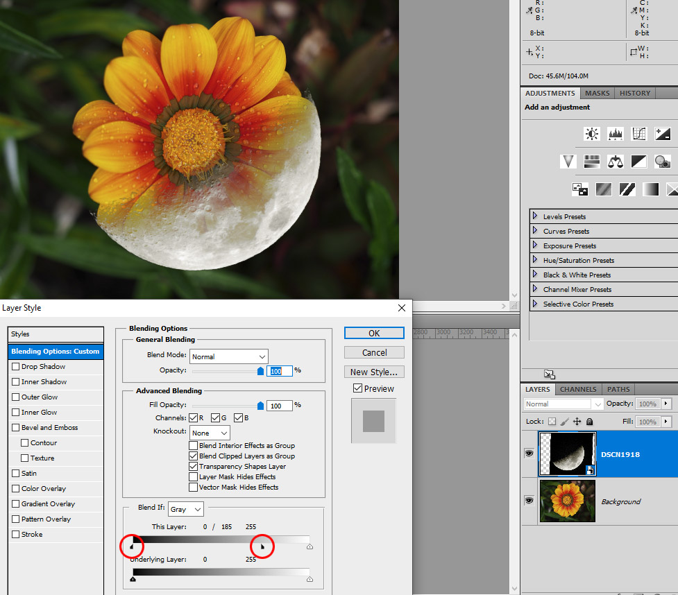
I put a moon photo over a flower photo, then used the darkness of the moon photo as the basis for blending. Everywhere the moon photo is black, the flower shows through, and I used the Alt key to split the slider segments to blend the moon more smoothly into the underlying flower.
Are you playing while you’re reading this? Play play play!
Let’s look at a real-life example. I wanted more "punch" for this photo, so I added a Hue/Saturation layer on "Soft Light" blend mode, with some added Saturation, to give it impact. And I loved the result, except for the very brightest and very darkest areas, which lost some detail:
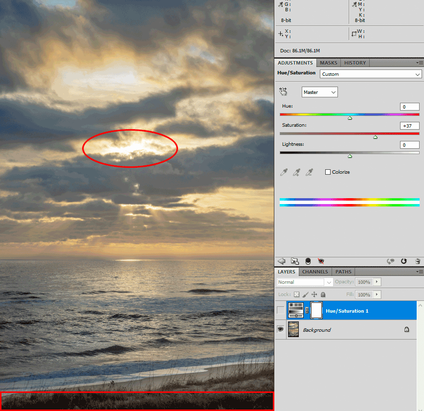
I know it’s a bit hard to discern in a dotty gif file, but I hope you can see what I mean. I’m losing detail in the grass at the bottom, and losing some detail in the brightest clouds.
So I used the Blend If sliders on that Hue/Saturation layer (yes, they can be used on adjustment layers as well as pixel layers) to make it transparent at the dark and bright ends:
Here is the outcome:

Can you see how the photo is still getting punch (in fact I was able to increase the Saturation slider even further) but the dark and bright areas are protected?
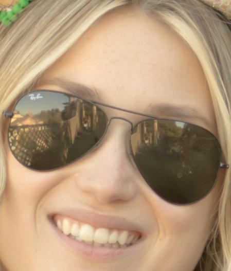
The next example is my most common use of Blend If. I’ve long wished that Adobe would give us the ability to apply noise removal more strongly to shadow areas of raw files than highlight areas. I figure it should be a simple slider to add. Anyway, until they do so, this is a workaround:
Here is a close-up of a raw file:

There is no noise in the brighter areas, but still some noise in the dark tones of the glasses.
But when I remove enough noise to clean up the glasses …
… the bright areas are too smooth. In fact, I’ve lost some of the lovely freckle detail in her forehead.
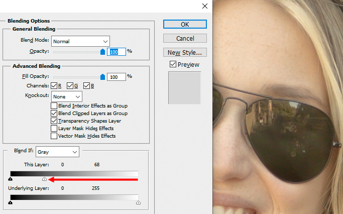
So I open both versions into Photoshop. First the "less smoothing" version, then I put the "more smoothing" version on top of it. Then I open the Blend If window, and first I pull the whole white slider in until the glasses are still smooth, but the rest isn’t overly smooth.
Then I Alt-click to split the slider, and move it back out to ensure the layers are blended beautifully, without any jagged edges.
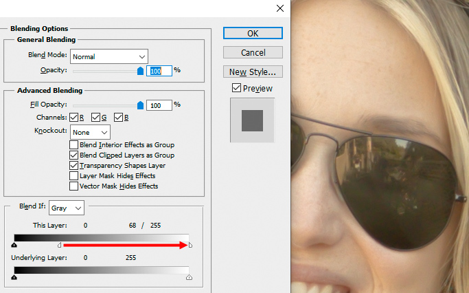
My end result is perfect smoothness everywhere, while maintaining the nice freckle detail on her forehead.
I have one more example to show you. This is really obscure, and requires a deep understanding of channels.
My student Mary wanted to know how to green up the grass behind her subject. The easy answer is to apply some green Photo Filter to the area:
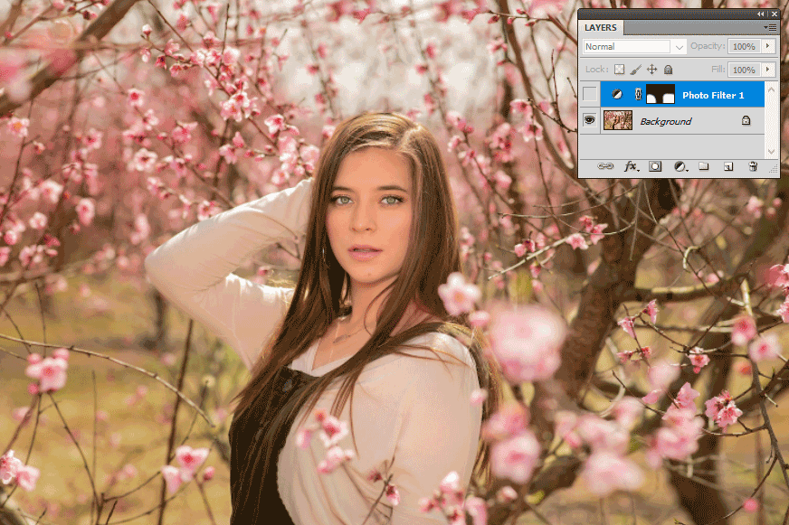
I expect you’ve spotted the problem straight away. The green has killed the lovely pinkness of the flowers. It’s also made the tree branches unnecessarily green.
Of course Mary could have taken the time to painstakingly mask around all the flowers and trunks. But …

So instead she could cleverly use the Blend If sliders on the Blue channel:
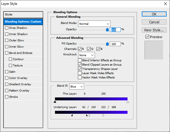
To ensure that the green is only applied to the medium tones of the grass, not the darker tones of the branches nor the lighter tones of the flowers:
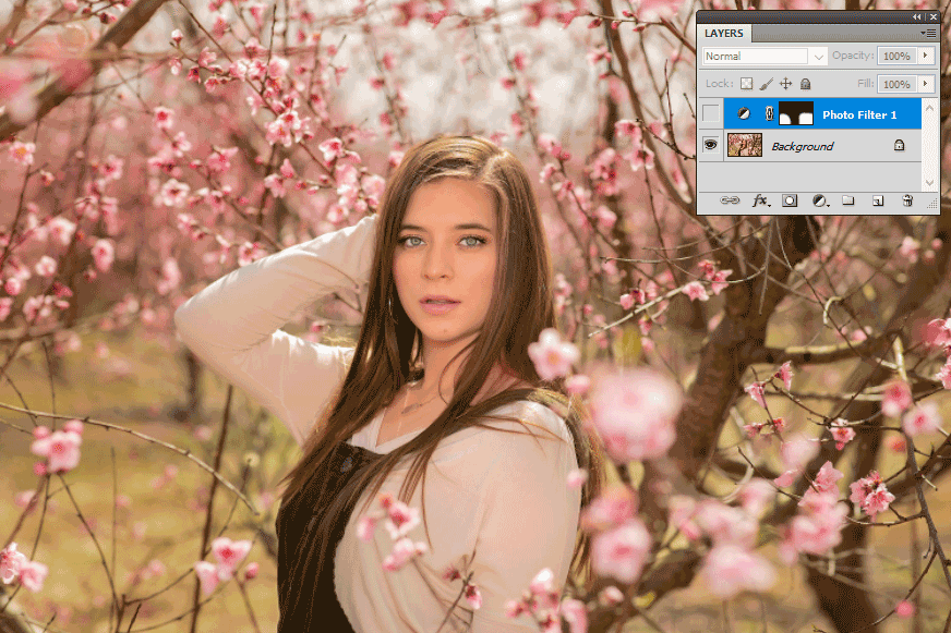
I don’t expect you to know how to achieve this one on your own, at least not until you’ve taken The Channel Mixer Class, but it’s a good example of the power of this function.
Thanks for reading. I hope you’ll enjoy creating some funky artistic dual-photo effects with these sliders.