
Simple storyboard tutorial – part 2: multiple photos
This post is an extension of my last one – Simple clipping mask and storyboard tutorial. If you’re new or relatively new to clipping masks in Photoshop, I encourage you to go back and read it before continuing here.
If you’re not new to storyboard creation, you’ll notice that the method I’ll explain in this article is a little different from most storyboard tutorials. I assure you I have good reasons for this, and I’ll explain them as I go along.
I’ve captured the screenshots for this tute in Photoshop CS2. The methods apply to all versions of Photoshop, and to Elements 9 onwards, but NOT Elements 8 or earlier, sorry.
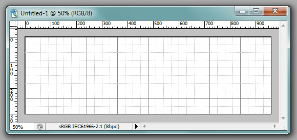
As I explained in the previous post, half the battle can be won before you even start, with a bit of planning. For this example, I want to make a three-image panoramic storyboard to go on Facebook. I choose a width of 960 and a height of 300. I turn on gridlines every thirty pixels, and I’m ready to go:
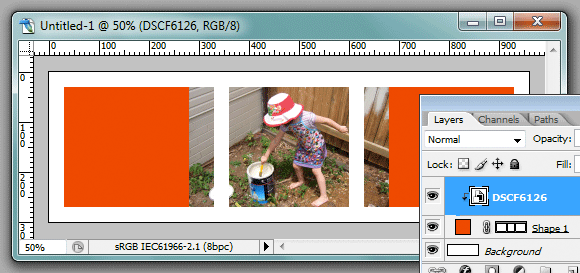
I choose the rectangle shape tool, and I set my foreground colour to a bright red. That red has nothing to do with the eventual design – it’s just for the clipping shapes. I like bright colours for my clipping masks, for reasons I’ll explain in a moment.
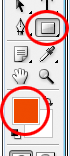
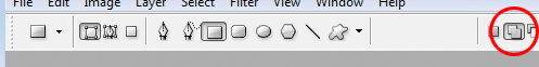
In the Options Bar, I make sure I’ve chosen the correct settings, as circled here:
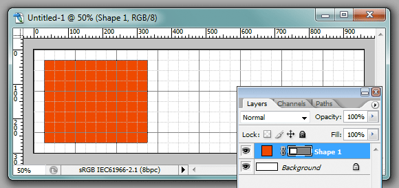
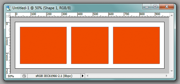
Then I go ahead and draw the clipping shape for the first photo. It appears as "Shape 1" layer in the Layers panel:
Now, this is where my method differs from others. Most tutorials will advise you to create separate shape layers for ever image. I do not like this approach. I prefer to keep all my shapes on one layer. The first, and very obvious, reason is that it significantly reduces the number of layers I have in a layout. Keeping things simple is very important to me. The second reason I’ll discuss later.
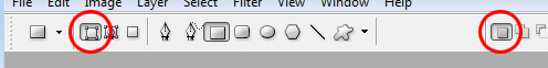
So, here’s the key. In the Options Bar, I choose the "Add to shape area" icon, as circled here:
With that icon enabled, I can draw the other two clipping shapes on the same layer:
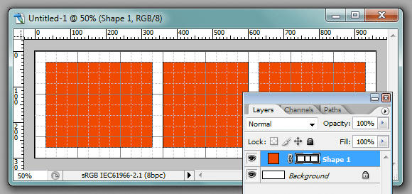
Now, I don’t need the grid any more, so I press Ctrl ' to hide it; and this is what I’ve got:
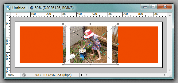
You know this part. I go to File>Place, and choose a photo. I’ve done the middle one first in this case (but of course it doesn’t matter, you can do them in any order):
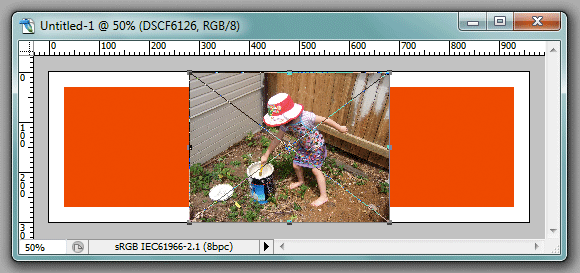
The Place function presents the image to me with the transform handles attached, but I don’t need those at the moment, so I press Enter. Then I hit Ctrl Alt G to clip the image to the clipping shape (Ctrl G in Elements):
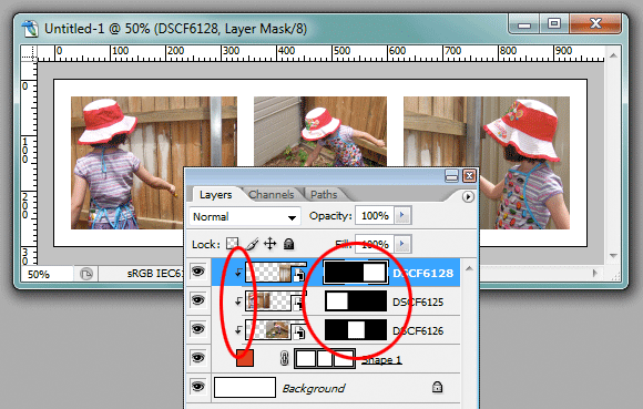
In the Layers Panel above, you can see the little arrow on the image layer, indicating it is linked to the shape.
Now I’m ready to resize, so I press Ctrl T to give me the transform handles again, and fiddle until I like the composition in that middle square:
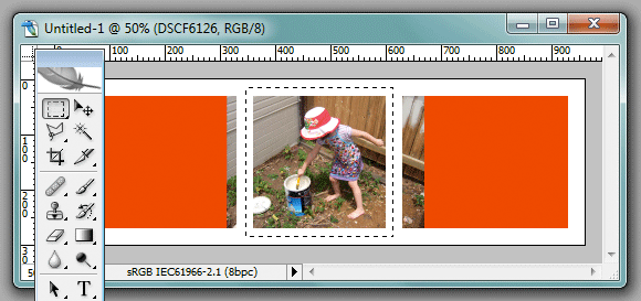
"Middle square" … that seems to be a problem, right? Take a look at the above screenshot again – the edges of the photo are appearing in the other two clipping areas. Oh no!
Relax, it’s a piece of cake. I just choose my Marquee Tool, and loosely draw a marquee around the target shape. (You can turn the grid back on momentarily if it helps, but I usually find that’s unnecessary.)
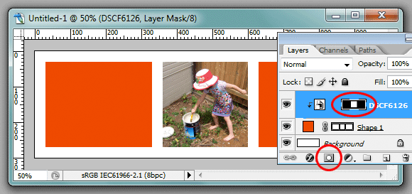
Then, I simply click the Layer Mask icon (the little circle-inside-a-rectangle) in the Layers Panel, and my marquee selection turns into the layer mask, and hides the extraneous part of the photo from view. Neat, eh?
Now, it’s just lather, rinse, repeat. I place/clip/transform/mask each of the other two photos, and my storyboard is complete. Only a few minutes’ work.
You can see how all the of the images are clipped together, linking them to the shape layer. And you can see each of them have their own mask:
(I mentioned earlier that I like to use a bright colour for my shape layer. This is so that I can see at a glance if I haven’t positioned one of my photos properly. If I scan my eyes over the layout, and see a bright red edge somewhere, it instantly tells me I have to check the placement of an image.)
Ok, so right now you’re probably still thinking "Why? Why is this whole mask business better than clipping each photo to individual shape layers? It seems like more work to me, not less."
Well, the first benefit I’ve already mentioned – fewer layers. This layout comprises four layers, whereas it would be six if there was one clipping layer per photo. Four … six … whatever, right? But if you start to make bigger storyboards, you’ll be very grateful for the simplicity of this method. Eleven layers instead of twenty in a ten-photo storyboard is a lot easier to manage.
But that’s nothing. The second benefit is much more significant. It involves layer effects – borders, shadows, etc. If you have separate clipping layers, you have to set up the layer effects on each individual layer. Gah! Sure, you can alt-drag them from one to another, so it’s not that painstaking. But watch this:
I select the shape layer, hit the Layer Effects icon …
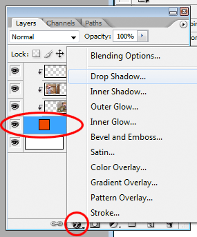
… and in a couple of clicks, apply a border and a drop shadow to all three photos at once. Bam!
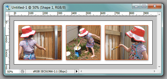
And if I decide I don’t like that style, I can go back and change it as often as I like. And each change I make is instantly applied to all the photos on the layout.
If you haven’t done it this way before, I urge you to try it. You’ll love it.
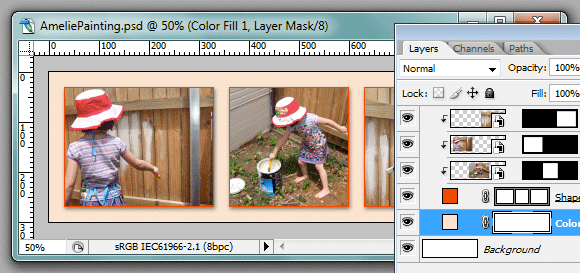
On this particular design, I belatedly decided it needed a background colour, so I just selected the Background layer, then added a Solid Color layer. Easy stuff:
I hope you’ve enjoyed this tutorial.