
Mangled watermarks on Facebook
Occasionally people complain to me that their logo goes all blocky and unclear when it’s used as a watermark on their photos on Facebook. On further enquiry, I generally find that this happens with logos of very vivid colours, or plain logos placed onto areas of very vivid colour on the photo.
Yes, this is because of the aggressive jpeg compression that Facebook applies to our photos, which photographers are always eager to complain about at any opportunity. As I’ve insisted in the past, we we can't blame Facebook for doing this.
Facebook didn't invent Jpeg compression, though. It was devised many years beforehand. And it is the nature of jpeg compression that very pure primary colours get degraded more than most. I don’t understand how it works, and it’s not important that you do either. We must simply accept that it is so, and find ways to manage it.
Before I delve into matters of compression, I must point out that it can be avoided on Facebook business pages by using PNG files instead. PNG files have no compression. There are some caveats, though:
- PNG files only work on business pages. If you upload a PNG file to a personal page, or a group, Facebook automatically converts it to a Jpeg file.
- Even on business pages, Facebook only seems to allow PNG files smaller than 1MB. If you upload a PNG file that’s larger than one megabyte, Facebook automatically converts it to a Jpeg file.
- PNG files are bigger, so they will take longer to upload, and longer for people to view. This concern has almost completely diminished, though, in this age of fast internet speeds.
So, small-sized PNG files for your photos on your biz page. That will avoid this problem.
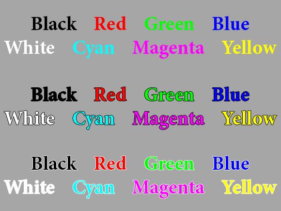
Let’s take a look at the problem. For this exercise, I created this file:
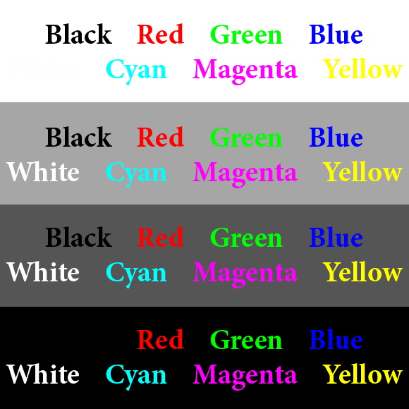
Then I uploaded it to Facebook, and here is the result:
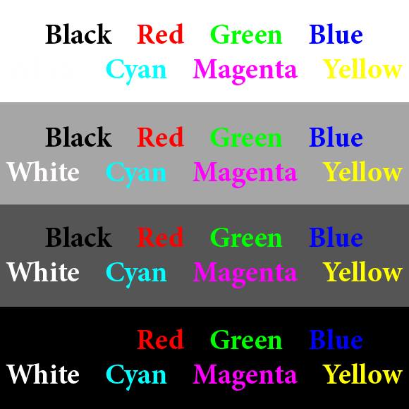
You can see that the black and white fared reasonably well, and so did the blue and yellow to my surprise. The cyan got a bit mangled, and the red, green and magenta were butchered terribly.
So it seemed that black, white, blue and yellow are the safest primary colours for logos on Facebook. So I created another test for those colours, placed on vivid backgrounds:
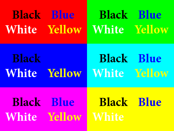
I uploaded it, and this is how it turned out:
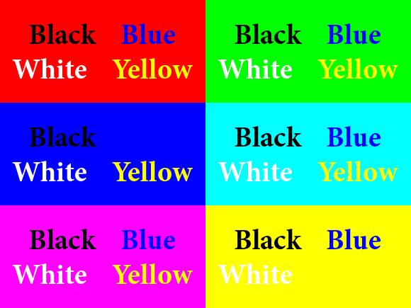
White and yellow still fared ok, but black and blue got damaged against some backgrounds.
So what does all this mean? Should we throw up our hands in despair? No, of course not. As ever, the truth is that very few "normal" people notice these things. Members of the public don’t even glance at issues that we lose sleep over.
More importantly, the degradation isn’t as noticeable against normal busy photo backgrounds. Take a look:
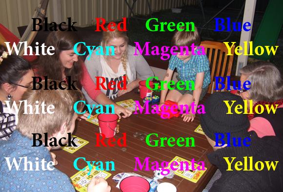
Yes, of course the damage is there. But it’s not so obvious and offensive. As I said, regular punters won’t even notice.
(There is dual importance, of course, in placing your watermark on a busy part of the photo. If you put it on a plain area of seamless background, even the least skilled image thief can easily clone or paint over it. For maximum image security, we should be positioning our logo on a prominent and hard-to-clone part of the image.)
There’s another method I want to mention. In my testing, I found that putting a white or black border around the text kept it much safer from degradation. Take a look at the green, especially:
Again, I don’t know why this works, but it seems to. I have a white border around my own watermark for this reason.
(A border is advisable anyway, because it also ensures that a watermark is readable against any background.)
Notes:
- If you’d like to learn more about the basics of creating a watermark, go here.
- If you have Photoshop (not for Elements, sorry) and you want to save a LOT of time by batch watermarking, go here.